
A New Adspace
A company’s brand does more than communicate its name. It informs you of its culture, its people, its product. A good brand is clear, concise, and memorable. Finally, a brand needs to serve its customers just as effectively as it serves itself. Earlier this year we set out to change our image to match these values, and today we are really proud to share our new brand with you.
Our previous branding – which we had for about 10 years – wasn’t serving us well anymore. First, the main focus of the old logo – “Mall Network” – isn’t how we, our any of our clients refer to us. To ourselves and everyone we know we’re just “Adspace”. Period. Second, we are a high-tech company with a young employee base. A wordy logo composed of a serif typeface containing a visual pun playing off “TV” didn’t appropriately represent who we are.

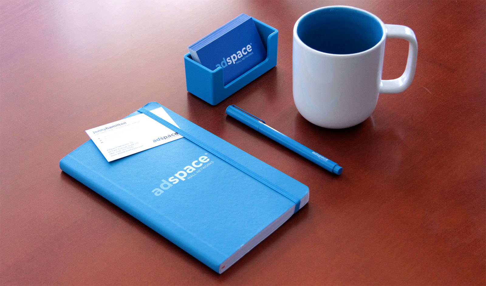
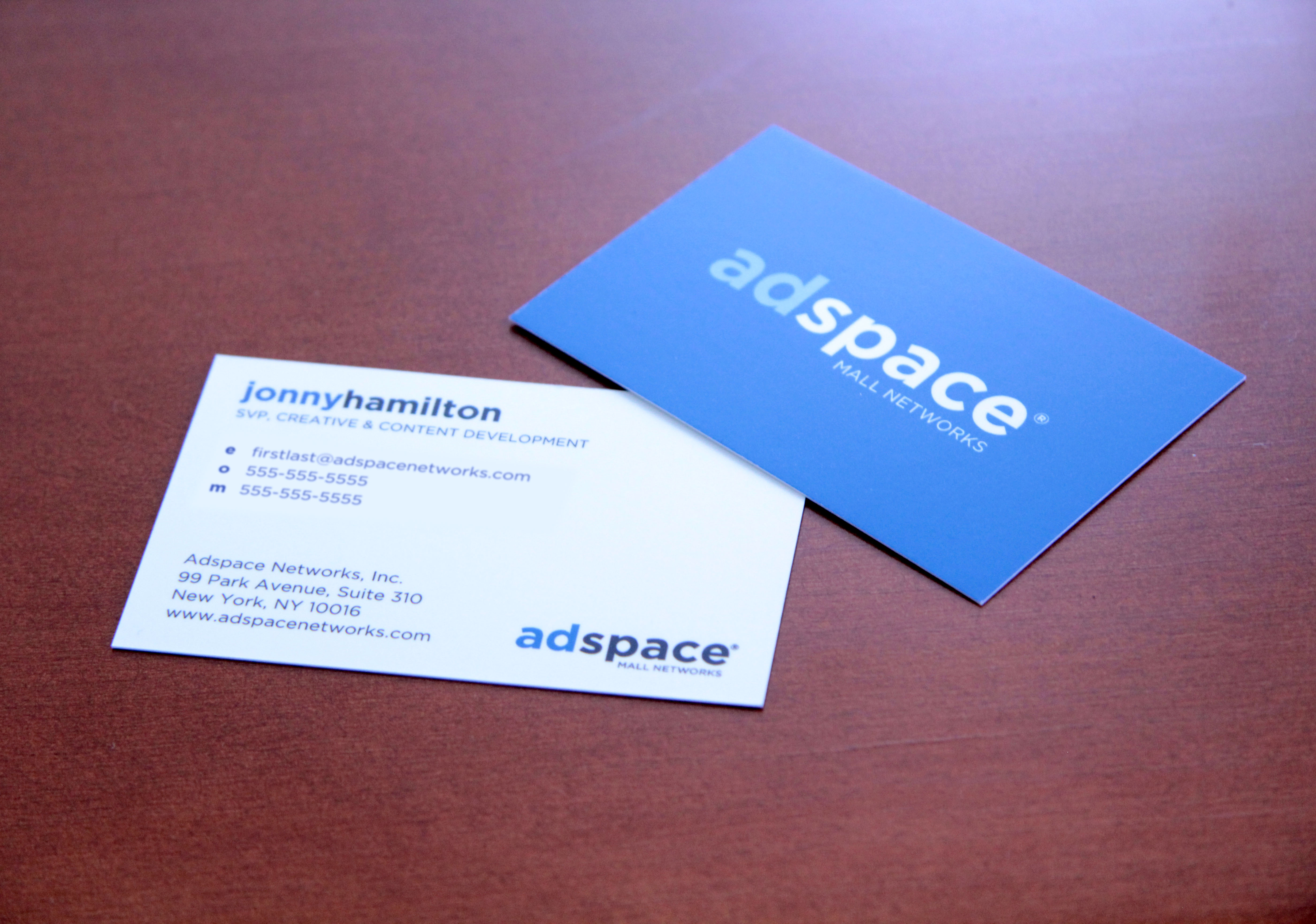
Our new logo embraces our name and simplifies the message drastically. It’s designed to be easier to read and reproduce at more sizes; and fit in better with other logos in our industry. Our new brighter palette and typeface family speak better to our culture and flexibility. Combined, these elements create a new brand to represent both our product and our people.
We also took the time to re-design our website and marketing materials to focus on the quality and scale of our network. We want our message to be focused, clear, and convincing.
We are a small company of passionate people and we are thrilled to now have a brand that more accurately represents what we feel we are: Young. Professional. Reliable.